 "Almost A Wooden Bird" (AlmostAWoodenBird)
11/16/2015 at 14:46 • Filed to: fonts, rants, not cars
 4
4
 45
45|
"Almost A Wooden Bird" (AlmostAWoodenBird)
11/16/2015 at 14:46 • Filed to: fonts, rants, not cars | 4
| 45 |
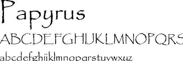
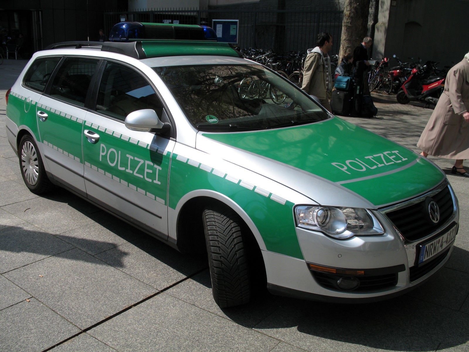
This post isn’t about cars. I’m sorry, it’s not. I could tell you about the generally horrible Chevy Captiva Sport I’ve been driving since my car got wrecked, but there’s nothing captivating or sporting about it. So, no, there’s another pressing matter. Papyrus. No, not papyrus the ancient Egyptian form of paper, nor Papyrus, the overly-expensive card shop in which the prices only make sense if they were actually printed on papyrus, but I’m talking about papyrus the font.
That horrible, no good, God-awful, Windows 94 lookin’, granola-entrepreneur usin’, font that every “creative” with a small business has used to show off their individuality since 1982. That’s right folks, NINETEEN-EIGHTY TWO .
You’ve seen papyrus. Probably even used it. Actually, I bet you walked by it this morning on the way to work and didn’t even notice it . “Closed today. Namaste,” a wrinkled sheet of purple printer paper with a tear where the dot-matrix ribbon was torn off reads. Or maybe it was in pale green on the totally landfill safe, triple-recycled coffee cup sleeve from Mocha Johnny’s you grabbed this morning. Because papyrus means eco-friendly. Hell, eco-friendly became a household saying probably DUE to papyrus’ herpes like effect on nu-hippies.
Take a stroll through Trader Joes and I bet you’ll see papyrus’ ugly head somewhere on a bag of oat chips or kale blueberries. But the thing that really stings is when real companies use PAPYRUS AS A LOGO. Take Edible Arrangements, for example.

How could you do that to us? To your investors? To your employees?
Let me be clear: if you see a sign or a banner written in papyrus by no means should you enter that facility or store. You should not patronize them or give them advice on how to run their company because they’ve chosen their path, and they chose papyrus. This choice probably occurred while sitting in a dark home office, staring at a cathode ray tube monitor jaundiced by dust, sadness, and age in Microsoft Paint Win98 edition. Eureka! Papyrus! My business plan is finished!
Oscar Wilde once said that consistency is the last refuge of the unimaginative and papyrus is consistently just the most unimaginative choice for your logo/sign/world saving slogan. C’mon. You’re an entrepreneur, can’t you think up something better than “Autumn Wind Resort” written in papyrus?
 CKeffer
> Almost A Wooden Bird
CKeffer
> Almost A Wooden Bird
11/16/2015 at 14:49 |
|
I rank it right up there with comic sans on the list of fonts that make me cringe.
 Leon711
> Almost A Wooden Bird
Leon711
> Almost A Wooden Bird
11/16/2015 at 14:50 |
|
It’s bad, but it’s not comic sans bad.
|
Almost A Wooden Bird
> Leon711
11/16/2015 at 14:51 |
|
But Comic Sans people know is a joke now. Earnest people still use papyrus out of sincerity! We need to shame it into comic sans territory.
 Nibby
> Almost A Wooden Bird
Nibby
> Almost A Wooden Bird
11/16/2015 at 14:52 |
|
Dear Papyrus...

Someone in grad school had a presentation and he used Papyrus as the font... the teacher stopped him after a few slides and said “Come back next week with a better presentation, better design, and better font.”
 Dusty Ventures
> Almost A Wooden Bird
Dusty Ventures
> Almost A Wooden Bird
11/16/2015 at 14:52 |
|
Sadly Papyrus has already been long abandoned...
|
Almost A Wooden Bird
> Nibby
11/16/2015 at 14:52 |
|
I would kiss that professor on the mouth.
|
Almost A Wooden Bird
> Dusty Ventures
11/16/2015 at 14:53 |
|
Oh God.
|
Nibby
> Almost A Wooden Bird
11/16/2015 at 14:53 |
|
Um, she is married
 Mr. Ontop, No Strokes, No Smokes...Goes Fast.
> Almost A Wooden Bird
Mr. Ontop, No Strokes, No Smokes...Goes Fast.
> Almost A Wooden Bird
11/16/2015 at 14:54 |
|
You are absolutely right! It is time for Comic sans and wingdings to have their time in the sun!
|
Almost A Wooden Bird
> Mr. Ontop, No Strokes, No Smokes...Goes Fast.
11/16/2015 at 14:55 |
|
I just threw up on my desk.
 Smallbear wants a modern Syclone, local Maple Leafs spammer
> Almost A Wooden Bird
Smallbear wants a modern Syclone, local Maple Leafs spammer
> Almost A Wooden Bird
11/16/2015 at 14:56 |
|
What if that business was founded in 1982? They have every right to continue using papyrus.
|
Smallbear wants a modern Syclone, local Maple Leafs spammer
> CKeffer
11/16/2015 at 14:57 |
|
I have to say I really don't get the comic sans hate...
 $kaycog
> Almost A Wooden Bird
$kaycog
> Almost A Wooden Bird
11/16/2015 at 15:02 |
|
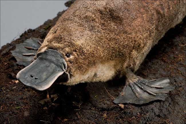
I first read papyrus as platypus. I’ll close the door behind me.
|
CKeffer
> Smallbear wants a modern Syclone, local Maple Leafs spammer
11/16/2015 at 15:03 |
|
http://www.comicsanscriminal.com/
this explains it pretty well.
|
Almost A Wooden Bird
> $kaycog
11/16/2015 at 15:04 |
|
Dawwwwwwwwwwwwwwww
 Andy Sheehan, StreetsideStig
> Almost A Wooden Bird
Andy Sheehan, StreetsideStig
> Almost A Wooden Bird
11/16/2015 at 15:05 |
|
I blame Avatar.
 Xyl0c41n3
> Almost A Wooden Bird
Xyl0c41n3
> Almost A Wooden Bird
11/16/2015 at 15:05 |
|
Tell that to Farmers Only dot com. They LOVE comic sans. I tried to do a google image search so I could paste some examples in here, but then my eyes started to bleed and I rushed to close the tab.
|
Almost A Wooden Bird
> Smallbear wants a modern Syclone, local Maple Leafs spammer
11/16/2015 at 15:05 |
|
If you’ve made it this far with papyrus and your, I dunno, hard drive consulting business? is still in business then sure, you’re the exception.
 Steve is equipped with Electronic Fool Injection
> Almost A Wooden Bird
Steve is equipped with Electronic Fool Injection
> Almost A Wooden Bird
11/16/2015 at 15:05 |
|

|
Almost A Wooden Bird
> Xyl0c41n3
11/16/2015 at 15:07 |
|
Tell ya what: I went to farmers dot com once and only saw horses (literal, horses)
|
Almost A Wooden Bird
> Steve is equipped with Electronic Fool Injection
11/16/2015 at 15:07 |
|
I think I’m hyperventilating
 TheJWT
> Almost A Wooden Bird
TheJWT
> Almost A Wooden Bird
11/16/2015 at 15:07 |
|

I’d say the same with Myriad. It’s not offensively bad like Papyrus, but every lazy moron at my school uses it for presentations because it’s the default font in Adobe Illustrator. Evey time I see it I just think “You didn’t really try, did you?”
|
Almost A Wooden Bird
> TheJWT
11/16/2015 at 15:08 |
|
If you’re going to be that lazy at least go Helvetica
|
Smallbear wants a modern Syclone, local Maple Leafs spammer
> CKeffer
11/16/2015 at 15:10 |
|
Yes, and while I get that it is unsuitable in a large number of the situations that it is used, sweeping statements like
I rank it right up there with comic sans on the list of fonts that make me cringe.
don’t make sense to me. If I’m writing a resume or something, I’ll use Times New Roman. If I’m doing something that doesn't have a serious nature, I see no reason for you to be cringing.
|
Xyl0c41n3
> Almost A Wooden Bird
11/16/2015 at 15:11 |
|
So, funny you should mention horses. A second ago I was just leaving a comment mentioning Tindr on a post that mentions Grindr. So... in light of that and how you only saw horses on it, should Farmers Only be rebranded as Ridr?
Ok, ok.... I’ll show myself out, now. Heh.
 Danimalk - Drives a Slow Car Fast
> Almost A Wooden Bird
Danimalk - Drives a Slow Car Fast
> Almost A Wooden Bird
11/16/2015 at 15:13 |
|

|
Smallbear wants a modern Syclone, local Maple Leafs spammer
> Almost A Wooden Bird
11/16/2015 at 15:14 |
|
I’m just saying, if you started that way that long ago, if it’s in your logo, YOU are not a sheep. YOU have no reason to be ashamed.
EG: Apple started the trend of putting "i" in front of stuff. It is now a cliche. If you do that to your product, it looks really cheesy and stupid, with one exception. The exception is Apple products.
|
Almost A Wooden Bird
> Smallbear wants a modern Syclone, local Maple Leafs spammer
11/16/2015 at 15:22 |
|
Agreed. And if any of those 1982-prenuers send me a message I will 100% acknowledge them!
|
Almost A Wooden Bird
> Xyl0c41n3
11/16/2015 at 15:23 |
|
Haaaaaaaaaaaaaaaaaaaaaaaaaahahahaha. Alright, I was waiting for the punchline there and was not let down. +1
|
Smallbear wants a modern Syclone, local Maple Leafs spammer
> Almost A Wooden Bird
11/16/2015 at 15:27 |
|
Exactly my point!! :)
 Urambo Tauro
> Almost A Wooden Bird
Urambo Tauro
> Almost A Wooden Bird
11/16/2015 at 15:30 |
|
I like Papyrus. It’s elegant.
But it’s overused. It needs to go away for a while and come back SLOWLY.
|
CKeffer
> Smallbear wants a modern Syclone, local Maple Leafs spammer
11/16/2015 at 16:01 |
|
I’m going to assume that you have done little to no graphic design work in a professional capacity. Please correct me if I’m wrong, but you would be the first I’ve ever seen actually trying to defend the font. And this is with good reason. 99% of the time when one of us is asked to use that font on a project, the client is a complete moron, and a nightmare to work with to the point that we begine to question if the amount we’re getting paid is worth the aggravation. As a result of this, a very large number of us have developed a very negative association with the font. Pair it with the aforementioned rampant missuse, and you wind up with a situation where folks who have graphic training have just come to hate the font. If that doesn’t help you understand, then I really can’t help you. Now, whether you agree with it is another story completely, but agreement is not required for understanding, I have found.
|
Smallbear wants a modern Syclone, local Maple Leafs spammer
> CKeffer
11/16/2015 at 16:05 |
|
No, that makes sense when you put it that way. I still have to say I personally like it :)
 KusabiSensei - Captain of the Toronto Maple Leafs
> Almost A Wooden Bird
KusabiSensei - Captain of the Toronto Maple Leafs
> Almost A Wooden Bird
11/16/2015 at 16:14 |
|
Can we at least ban Comic Sans *first* before going after Papyrus? I mean, Papyrus is really less offensive than Comic Sans in something that is not intended to be playful.
The lack of general adoption of, say, Fruitger, is annoying. Much much better choice.
 Under_Score
> Almost A Wooden Bird
Under_Score
> Almost A Wooden Bird
11/16/2015 at 16:15 |
|
We had a Captiva Sport a couple years ago. I expected it to be awful, which is why I told my dad to get it, but I was surprised. It was a nice car.
 Manwich - now Keto-Friendly
> Almost A Wooden Bird
Manwich - now Keto-Friendly
> Almost A Wooden Bird
11/16/2015 at 16:34 |
|
I love Papyrus.
Papyrus needs to be used MORE.
Papyrus for ALL!!!

 Klaus Schmoll
> Almost A Wooden Bird
Klaus Schmoll
> Almost A Wooden Bird
11/16/2015 at 16:41 |
|
Comic Sans is the real culprit here!
Fun story: I got an invitation to a job interview in Comic Sans. Good pay, class A benefits etc... I got it and I am now contemplating when the right time will be to tell them to stop using COMIC FUCKING SANS!
Nobody takes you serious!
|
Klaus Schmoll
> Almost A Wooden Bird
11/16/2015 at 16:44 |
|
http://oppositelock.kinja.com/got-an-invitat…
Some people still think they can conduct serious business in Comic Sans.
Fun fact: I am working there now.
|
Almost A Wooden Bird
> Klaus Schmoll
11/16/2015 at 16:51 |
|
wut. Did you take it just to quit over that?
|
Almost A Wooden Bird
> Manwich - now Keto-Friendly
11/16/2015 at 16:52 |
|
What nooooooooooooooooooooooooo!!!
|
Almost A Wooden Bird
> Under_Score
11/16/2015 at 16:53 |
|
Ya know, honestly, it wasn’t terrible, but it just wasn’t anything above terrible either. It definitely car’d and I guess as a temporary car that’s all you can really ask for.
|
Almost A Wooden Bird
> KusabiSensei - Captain of the Toronto Maple Leafs
11/16/2015 at 16:54 |
|
How about we ban BOTH of them?
 boxrocket
> Almost A Wooden Bird
boxrocket
> Almost A Wooden Bird
11/16/2015 at 23:01 |
|
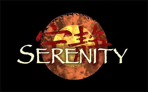
Papyrus’ swan smog was being used in one of my favorite movies. It should have been stopped using after then (2005).
Confession: I used it in 6th grade for a project about Egypt, where it fit well. I also used Comic Sans for a block of text on the same project. This was in the mid-’90s, before these were well-known fonts.
|
KusabiSensei - Captain of the Toronto Maple Leafs
> Almost A Wooden Bird
11/16/2015 at 23:18 |
|
Sure. I just think egregious misuse is a little more irritating than having absolutely no imagination.
Both are misused and past their “Sell By” date.
|
Almost A Wooden Bird
> boxrocket
11/17/2015 at 11:32 |
|
I forgot it was used on Serenity! Also, Egypt project: that’s ok!!!!!!!!